A little while ago, Crackberry.com did a review for the Meetup for BlackBerry 10 app. No, not my Meetup for BlackBerry 10 app, but an app by someone else. I know I haven’t worked a lot on my app, but it was a bit annoying to see a review for the app and have the reviewer claim that an app for Meetup was finally in BlackBerry App World, when I release my app almost an entire year earlier. I informed the app developer that I already had the app name and he changed his name. However, a couple of things happened during this duplicate app review. The first being that someone gave my app a bad review due to the file size. The other thing that happened is that apparently Meetup finally noticed my app and made me change my logo. Fortunately, I guess, changing my logo for Meetup has actually solved the issue of the file size of my app.
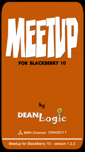
 For each type of device, BlackBerry has a different Splash Screen. The Splash Screen is the image that a user sees as the app is first opened on the device. The Splash Screen images are stored as assets in the application. Possibly, a developer could create a new build for each device and only store the appropriate logo and Splash Screen for that particular device bar file. That would probably get a little tedious and is prone to mistakes. Another option is to create just a minimum number of Splash Screens and let the device resize the image. This option might not be the best idea, because if you don’t have an image that the device recognizes, then you won’t have a Splash Screen at all. I personally figured it was best to create a screen for each device (landscape and portrait views), because there might be slight modifications to the different images and I want to make my app feel like it was made for each device, not just crammed into the appropriate size.
I had initially tried to be fancy and found a great image of black leather to use as my background for the Splash Screen. Then I added the Meetup logo, the BlackBerry logo and my DeanLogic logo. Each of the first two logos weren’t very fancy, but my DeanLogic logo had a bit of detail. Then I added some text and other items to complete the Splash Screen. When I finished making the all the images and compiled my app, I ended up with a 24 MB(23,446KB) app. I had left the app that size for few months, until that bad review. Oops! 
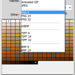
As I tried to fix this issue, I was driving myself crazy trying to figure out why it was so large, since I felt there wasn’t a lot to the app. The images didn’t seem to be very big and I figured that when everything was zipped up into a bar file, it would reduce the overall size, but it seemed to double the size of the app. I started messing around with the image and found that I was saving the export files in PNG 32. Well, that made the image file much larger than my final choice of PNG 8. There wasn’t anything noticeable in the image quality. My app size was cut down to 9 MB(8,977 KB). Yeah…. well, it was still a bit large.
Then Meetup came along with their request to change the logo.
Uh…okay.
I also had to change my app description to reflect that it wasn’t an official Meetup app.
Meetup Inc. does not endorse or sponsor Meetup for BlackBerry 10 by DeanLogic, and we are not affiliated with Meetup Inc. If you have any questions or issues about the app, there is a “Feedback/Support” form in the app settings menu for contacting DeanLogic support. If you have any questions or issues about Meetup site, got to Meetup.com.
Meetup helps groups of people with shared interests plan events and facilitates off line group meetings in various localities around the world. More than 9,000 groups get together in local communities each day.
The app description change was easier than the logo change and has already been implemented in BlackBerry App World. I couldn’t make the new logo look too much like a name tag, which is what the Meetup logo is based off of. I couldn’t make the font in the logo look like any type of magic marker, like someone wrote a name on the name tag, another Meetup touch. And finally, I couldn’t use the Meetup red or anything that looked too similar to the red in the logo. The orange on my DeanLogic site was apparently too close to the red, so I had to change the orange to more of a brown. There was a bit of an email chain trying to get the logo correct for Meetup standards, which had me discussing the issue with two different Meetup contacts over a few days. During this exchange, I also hinted that they should go after the other guy’s app as well, since he didn’t even alter the Meetup logo for his app. At least mine had my DeanLogic logo included to show that it wasn’t an official Meetup app.
The ending result, since I didn’t use an image as a background, but simply a colored path did make the app much smaller. While it isn’t what I wanted as a Splash Screen and logo, I now have an app size reduced down to 1 MB (1,157KB), a significant improvement from 24MB. And the app icon logo is probably a little better than my old app icon, just not the obvious Meetup logo. I guess that after the user downloads my app, the icon will become common place for them to click as the Meetup logo. I am leaving the inside of the app Meetup red, just to give the feel that the user is back on the Meetup site.
Now, I just need to finish adding the Group search and join feature so I can release the new app with the new images.
About DeanLogic
Dean has been playing around with programming ever since his family got an IBM PC back in the early 80's. Things have changed since BASICA and Dean has dabbled in HTML, JavaScript, Action Script, Flex, Flash, PHP, C#, C++, J2ME and SQL. On this site Dean likes to share his adventures in coding. And since programming isn't enough of a time killer, Dean has also picked up the hobby of short film creation.


