Maybe I CAN get this to work the way I want to.
I managed to figure out how to get php and Vue CLI to work together. Continue reading Maybe I CAN get this to work the way I want to.
code, applications, movies and thoughts about IoT, plus some other stuff
I managed to figure out how to get php and Vue CLI to work together. Continue reading Maybe I CAN get this to work the way I want to.
Trying to update old code with new code. Continue reading Dusting Off and Refreshing the Old Code
I try to make some cryptocurrency tokens work for me. Continue reading I went ahead and Stake it All! Stake it All!
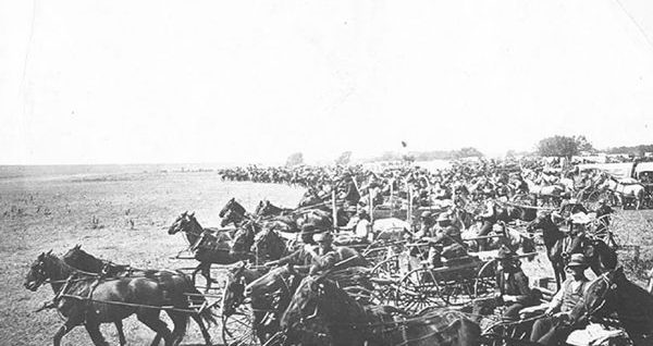
Claiming Your Stake For Rewards and Mining In the late 1800’s, citizens of the U.S.A. were given the opportunity to stake a land claim in the expanding territory of the west. One of these seven land run events was the Land Run of 1893, where an estimated 115,000 participants road horses, wagons, bikes or just ran to stake a claim on 6 million acres and 42,000 homesteads in what was previously grazing land for the Cherokee. The participants would have to run to a plotted out homestead, which was about 160 acres in size, and plant their flag. If you Continue reading Cryptocurrency : Proof of Stake
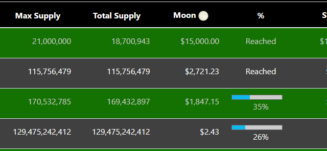
Working with PHP GD Image to Dynamically Create an Image Now that I have the correct max date query pulling the “To The Moon” coins list, it is time to work on creating an output image to let people share it with the world. From previous experience working with my website, before WordPress was WordPress, I knew that PHP had tools for manipulating images. I figured, I could take several images and text and combine them together to create a shareable image for each coin. While there is a great PHP image manipulation tool called ImageMagick, I am limited to Continue reading Creating A ‘To The Moon’ Image
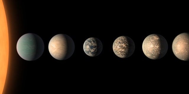
Colonizing Planets to Increase Resources It has been two weeks since I started playing SteemNova, an oGame based space strategy game using the 2Moon system. Welcome Back to Text Base Gaming Last week, in my Slow Times on SteemNova article, I mentioned that I had reached the point where each new level of building or research took a lot more Metal, Crystal and Deuterium. One of the ways to increase your resources is to colonize planets. You do this by researching Expedition Technology, building a Colony Ship and then sending it to a blank spot in your galaxy. While the price of the Continue reading SteemNova : Building My Galaxy